SERVICE MODULE // FRONT DOOR

Build the front door buyers understand fast.

The Buyer Entry System is website design for service businesses that turns the homepage, service paths, proof, and first calls to action into a clear front door for the right visitor. It answers the buyer's question before they have a reason to leave.

Five entry-layer structures

01
Message Hierarchy

The homepage opens with what you do and who it's for, not a company name over a stock photo. What you do, for whom, and why it's worth staying. Buyers decide inside eight seconds whether the page is relevant. The hierarchy answers their question before they've scrolled.

02
Service Path Architecture

Every major service gets its own page structured around how that buyer thinks. Not a bullet list under 'Our Services.' A real page the buyer with that specific problem can move through, with their question at the top, your answer in the body, and proof and a clear next action at the end.

03
Trust and Proof Placement

Reviews, credentials, photos, and results go where the trust question appears. Not on a separate Portfolio page the buyer never finds. Proof next to the service description. Near the question about cost. Before the contact button. Where the doubt actually lives.

04
First-Contact Clarity

One primary action per page, placed where momentum is highest. Not a footer form they find only if they scroll all the way down. The right form or call path at the right moment, when the buyer has enough information to act and not a second before.

WHAT IT IS

The Buyer Entry System is the structured work done to a service-business homepage and primary service pages. It replaces generic brochure content with a message hierarchy that answers four questions in order: what you do, who you help, why you're credible, and what to do next. The result is a front door that qualifies the right buyer and gives them a clear path before they decide to leave or stay.

THE REAL DIFFERENCE

A brochure site and a buyer entry system do different jobs.

Just a brochure site

The company is described. The buyer still has to decide.

Services are listed. There's a phone number. Photos look nice. But the buyer who just arrived, who doesn't know you yet, can't tell in eight seconds whether you're the right choice. Most click back before they find out.

Buyer Entry System done

The buyer knows what they're looking at before they scroll.

The homepage answers the four questions in order. Service pages are built around how that specific buyer thinks. Proof sits next to the doubt. The path to contact is clear, placed at peak momentum, and leads somewhere real.

WHO THIS IS BUILT FOR

If any of these sound familiar, the front door is the problem.

Getting visits, not calls

Traffic exists. The problem is the homepage doesn't tell a buyer who's never heard of you why you're the right choice. They land, see what looks like every other service company, and click back. The entry system fixes what they see in the first ten seconds.

Explaining the business on every call

The first five minutes of every call are the same: what you do, how you work, why you're different. That's the website's job. If you're doing it on the phone, the front pages aren't doing theirs. The entry system puts that explanation where it belongs.

Ranking well but converting poorly

The traffic is coming from the right searches. The problem is the page they land on doesn't close the gap. Good SEO, weak first impression. The Buyer Entry System fixes the page the traffic lands on, not the rankings that sent them there.

Good branding, low performance

The logo is sharp, the colors are consistent, the photography is real. But the site still reads like a placeholder. Good design without good structure is a brochure that loads fast. The entry system adds the structure the design can't do on its own.

WHAT THE SYSTEM BUILDS

Five entry-layer structures that turn a brochure into a buyer path.

These are structural decisions that determine whether a new visitor can figure out if you're the right fit, and what to do about it, before they leave.

01

Message Hierarchy

The homepage opens with what you do and who it's for, not a company name over a stock photo. What you do, for whom, and why it's worth staying. Buyers decide inside eight seconds whether the page is relevant. The hierarchy answers their question before they've scrolled.

02

Service Path Architecture

Every major service gets its own page structured around how that buyer thinks. Not a bullet list under 'Our Services.' A real page the buyer with that specific problem can move through, with their question at the top, your answer in the body, and proof and a clear next action at the end.

03

Trust and Proof Placement

Reviews, credentials, photos, and results go where the trust question appears. Not on a separate Portfolio page the buyer never finds. Proof next to the service description. Near the question about cost. Before the contact button. Where the doubt actually lives.

04

First-Contact Clarity

One primary action per page, placed where momentum is highest. Not a footer form they find only if they scroll all the way down. The right form or call path at the right moment, when the buyer has enough information to act and not a second before.

05

Search and AI Readability

Headings that answer the question instead of just naming the service. Paragraph openings that match what buyers type. Structure that gives search engines and AI answer systems a clear picture of what you do, who you help, and what happens next.

HOW IT WORKS

Four steps from audit to a front door that works.

01

Message Audit

We review the homepage, primary service pages, and first-contact paths. We document exactly what a new visitor sees, in order, before they make a decision, and where the path breaks down.

02

Hierarchy Build

We restructure the message so it answers buyer questions in the right order. Service descriptions, proof placement, and CTAs get rebuilt around how the buyer actually moves through the page.

03

Path and Capture Wiring

Every primary page gets a single clear next action. Forms, estimate tools, and contact paths are placed where momentum is highest and tested before anything goes live on the site.

04

Structure Pass

Headings, openings, and page organization are reviewed against what search engines and AI systems look for when answering buyer queries. Every page gets a clear answer to a specific question.

WHAT GOES INTO IT

Concrete work on the pages that matter most.

Every Buyer Entry System starts with a Blueprint audit. The audit shows what the current pages communicate, what's missing, and what needs to be rebuilt before any work touches the live site.

Start with a Blueprint
Homepage message hierarchy review and rebuild
Primary service page restructure around buyer intent
Trust and proof repositioned to where decisions happen
Single primary CTA per page, placed at peak momentum
First-contact paths wired and verified
Headings and openings structured for search and AI readability
Internal linking between homepage, services, and capture pages
Blueprint audit before any page is touched

SIGNS YOU NEED IT

The front door is losing buyers before they get a chance to call.

Most owners don't know the homepage is the problem. They just know the traffic doesn't turn into phone calls.

  • A visitor can't tell what you specialize in from the homepage alone
  • You're getting traffic from search but calls aren't coming from it
  • The homepage opens with your company name over a photo instead of what you do for the buyer
  • The most important call to action is in the footer
  • Your service descriptions are shorter and less specific than your competitors'
  • Buyers ask 'what exactly do you do?' at the start of every sales conversation
  • Your About page is longer and better written than your service pages
  • The site looks fine but a trusted friend said it doesn't really explain what you do

STRAIGHT ANSWERS

What owners ask before they start.

What's the difference between a Buyer Entry System and a redesign?

A redesign focuses on how the site looks. The Buyer Entry System focuses on what it communicates. You can have a beautifully designed site that loses buyers because the message doesn't land, or a simple site that converts because the structure is right. We fix the structure and message first. The visual execution follows.

Does the homepage need to be completely rebuilt?

Not always. The audit tells you what's working and what isn't before anything changes. Some homepages have the right raw material but the wrong order. Some are missing proof or a clear CTA. The work we do depends on what the audit finds, not on a template answer.

How long does this take?

The message audit takes a few days. The build and restructure typically runs two to four weeks depending on how many primary service pages need work. You'll know the full scope before anything changes.

Will this affect my search rankings?

Done correctly, it improves them. Cleaner page structure, better heading hierarchy, and clearer content signals help search engines understand what each page is about. The audit includes a baseline scan so you have something to compare against after the work is done.

What's wrong with having a general About Us page?

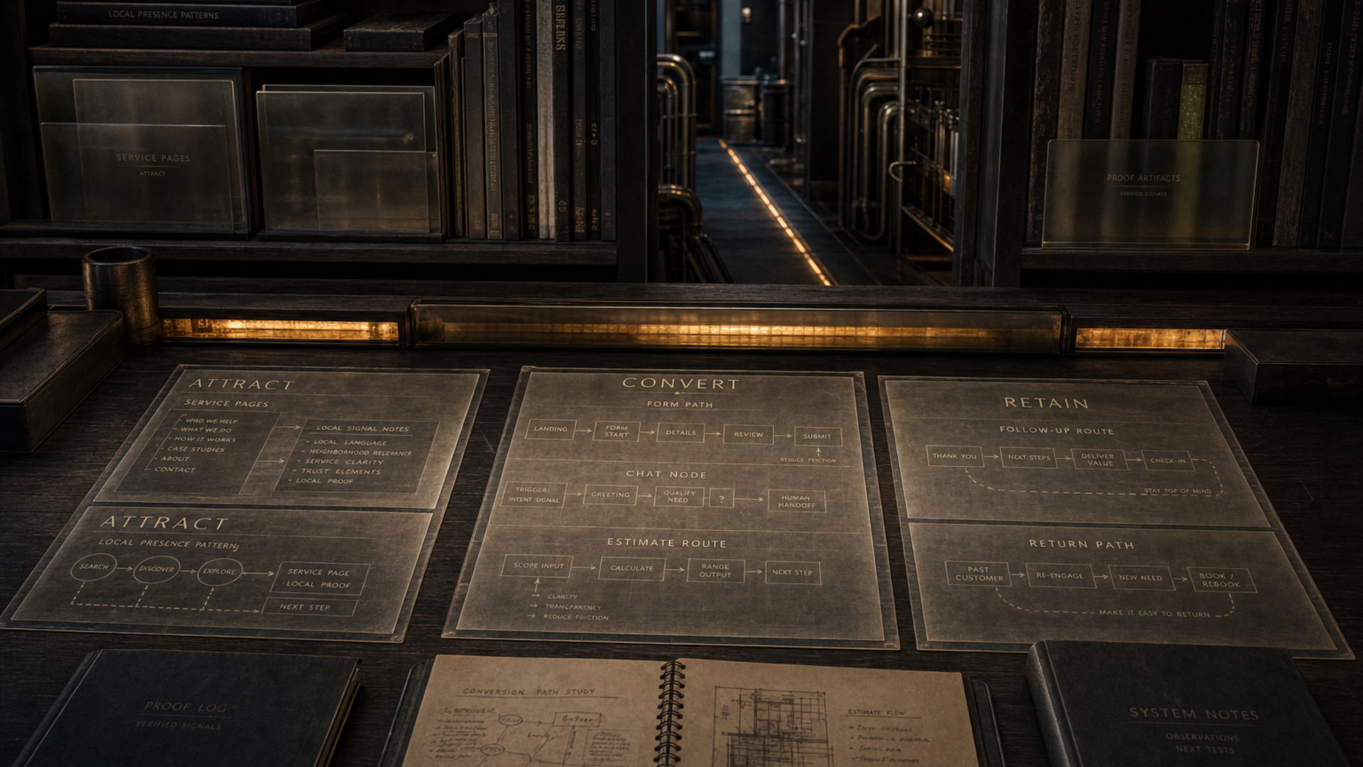
Nothing, as long as your service pages are stronger. The problem is when the About page is the most detailed writing on the site. Buyers who don't know you yet need service-level specifics, not a company history. The entry system puts the detail where the decision happens.

How does proof placement actually work?

The rule is simple: proof goes near the doubt. If a buyer is on a specific service page and wondering whether you've done this type of job before, that's where the photo or review lives. Not on a separate testimonials page. Not in the footer. Next to the thing they're evaluating.

Do I need a Buyer Entry System before I do SEO?

Yes, or at least in parallel. Running SEO to a homepage that doesn't communicate what you do is like running ads to a store with no signage. The traffic arrives and leaves. The entry system makes the front pages worth arriving at first.

What does 'message hierarchy' actually mean?

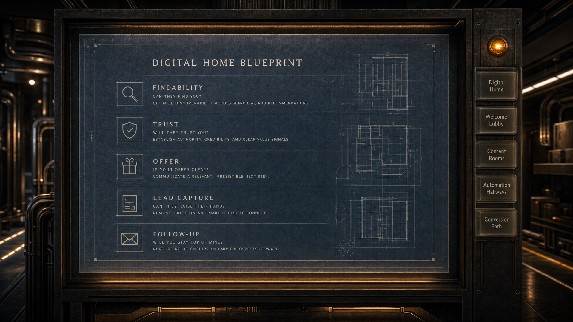
It means the order in which the page answers buyer questions. First: what do you do? Second: who is it for? Third: why should I believe you? Fourth: what do I do next? Most homepages answer those questions in the wrong order, or skip two of them entirely. The hierarchy fix puts them in the right sequence.

Can I keep my current branding?

Yes. The Buyer Entry System works within whatever visual direction is already set. We're rebuilding the message and structure, not the logo or color system. If the branding is working, we leave it. If there are areas where the design is getting in the way of the message, we flag them.

What's the next step after the front pages are working?

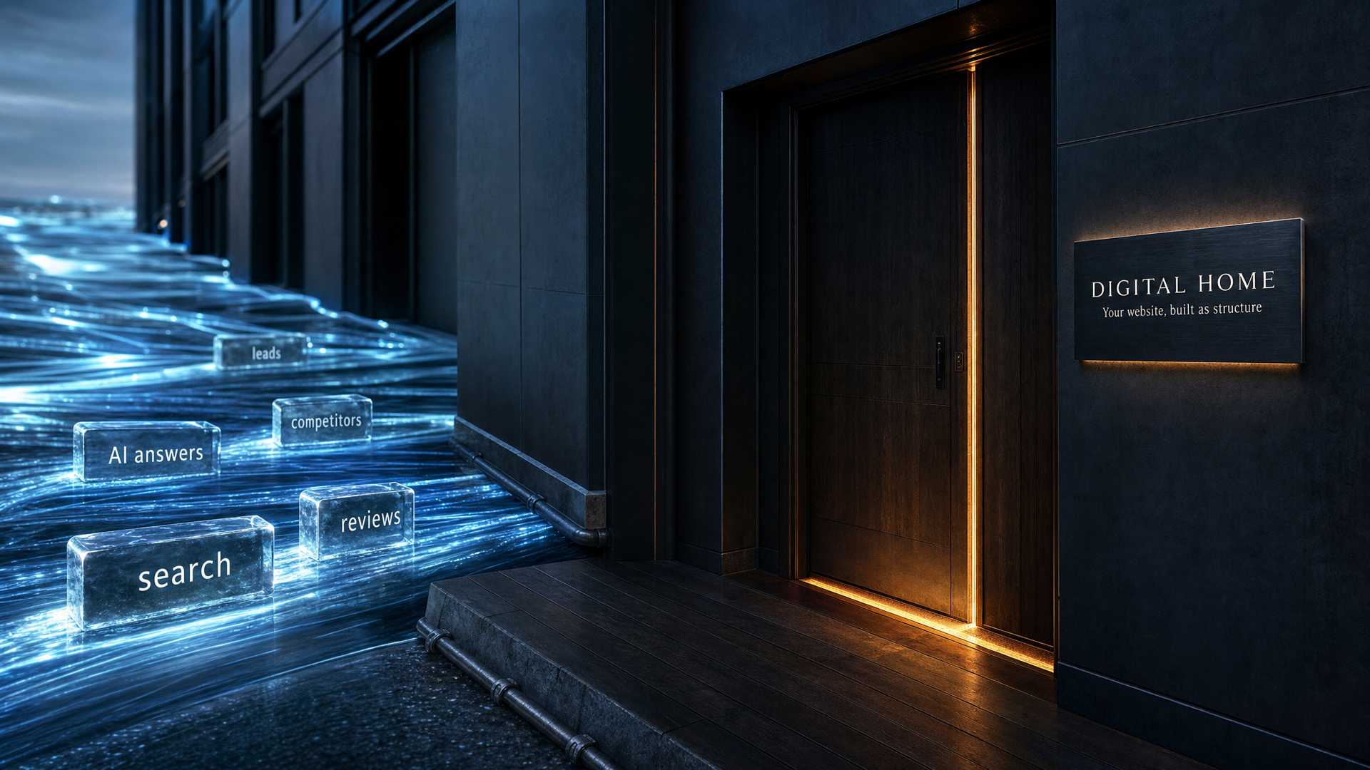
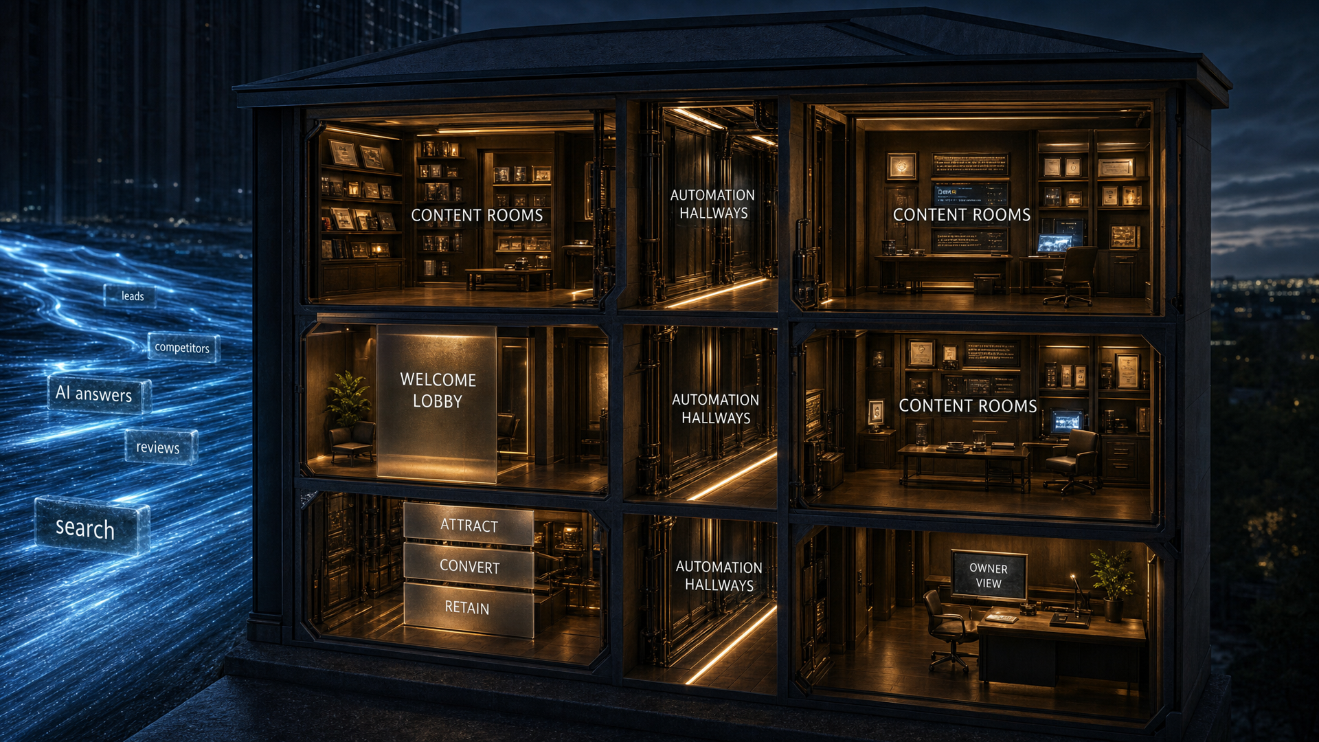
The Digital Home Setup extends the same buyer-path structure to every service, every category, and every question type the site needs to answer. The entry system is the front door. The full setup is the whole house.

DIGITAL HOME BLUEPRINT // READY

Find the gaps that are costing you better conversations.

The blueprint reviews your services, proof, buyer questions, lead paths and follow-up structure, then shows what should be fixed or built first.

Start Your Blueprint See what is working, what is missing, and what to fix first.
01 Digital Home
02 Welcome Lobby
03 Content Rooms
04 Automation Hallways
05 Conversion Path